Website UI Design
Marketing and business site design with a clear visual hierarchy, built around the action you want visitors to take.
Product and web interface design from someone who builds the result — so what gets designed is what actually ships, down to the states nobody thinks about.
A lot of design handovers fall apart at the same place: the mockups cover the ideal screen, and everything else — loading, empty, error, long names, slow connections — gets improvised during development. That's where products start feeling cheap.
Because I build what I design, those states are part of the design, not a surprise later. The result is an interface that survives contact with real data, real content lengths and real devices.
Most clients take design and build together — the web development side is where the design actually becomes a working product.
Marketing and business site design with a clear visual hierarchy, built around the action you want visitors to take.
Dashboards, admin areas and app screens designed for the people who use them every day rather than for a screenshot.
Reusable components, type scales, colour tokens and spacing rules, so the tenth screen looks like it belongs with the first.
Layouts designed at mobile, tablet and desktop — not one desktop mockup with the rest left to chance.
Going through an existing product to find where users get stuck, then fixing the flows rather than just repainting them.
Turning designs — mine, yours or your designer's — into pixel-accurate, responsive, accessible frontend code.
Six stages, each with something you can see and sign off.
We go through who uses the product, what they're trying to do, and where the current experience gets in their way.
User flows and site structure mapped first, so the design solves the right navigation problem before any visuals.
Wireframes, then full UI designs covering every state — including empty, loading, error and the long-content cases.
Designs turned into a component system and built as responsive, accessible frontend code.
Checked on real devices and against contrast and keyboard-navigation standards, not just reviewed as images.
Design files, components and documentation handed over so your team can extend the system consistently.
One software engineer, not an agency layer. Direct communication, one person accountable, no budget spent on account managers.
I build what I design, so nothing gets quietly dropped in development because it turned out impractical.
Empty, loading, error and long-content states are designed up front. That's where most complaints about a product come from.
Contrast, focus states, semantic structure and keyboard navigation are part of the design, not an audit finding later.
A real component system with tokens for type, colour and spacing, so the product stays coherent as it grows.
Small screens get their own layout decisions instead of being a compressed version of the desktop design.
I'll tell you when a design idea will hurt usability or cost far more to build than it's worth, and suggest the alternative.
Real projects where ui/ux design was part of the build. Each one has a full case study.
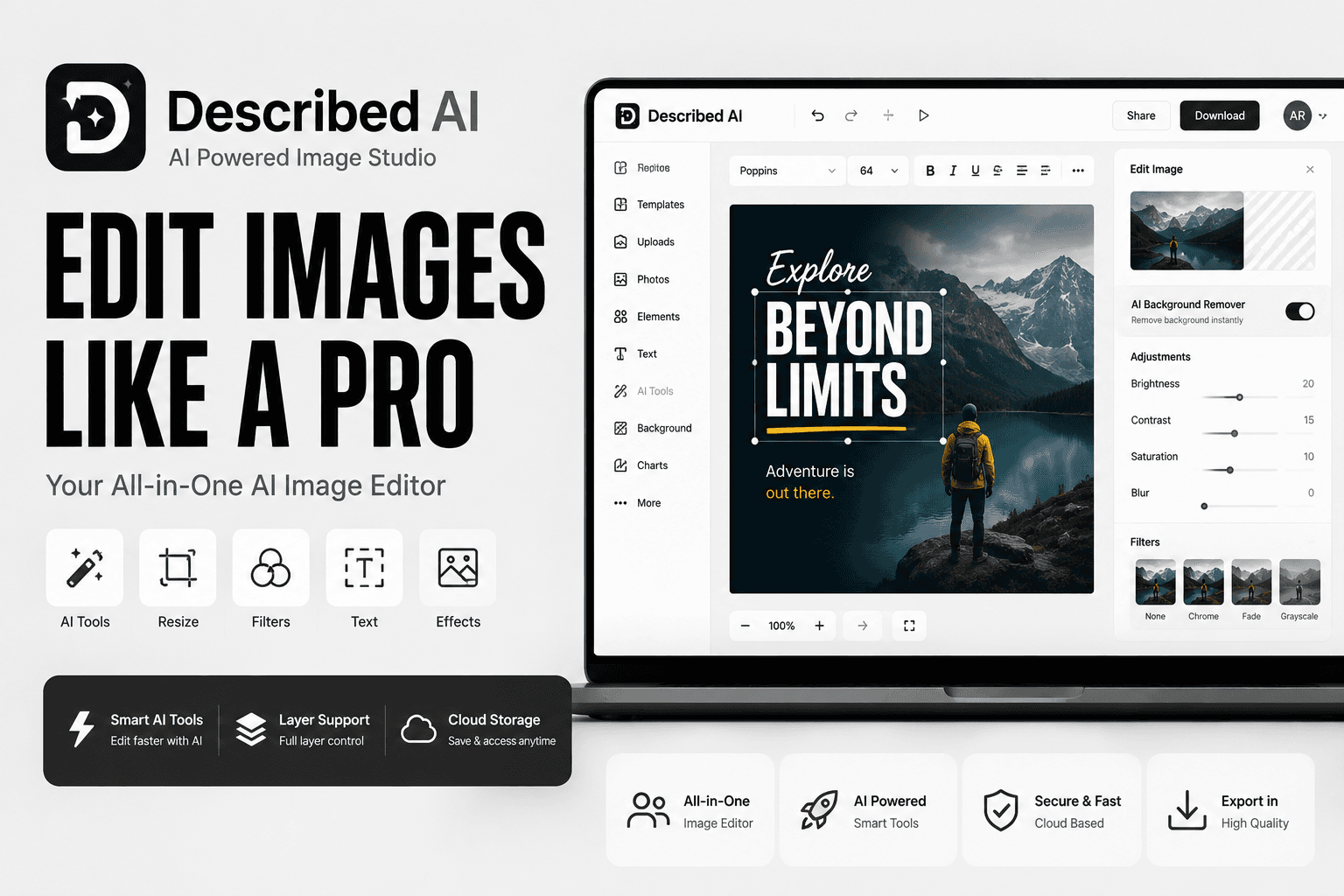
A Canva-style design tool powered by AI, with separate dashboards for each type of user.

An online beats store, rebuilt from a slow WordPress site into a fast custom storefront with its own music player.
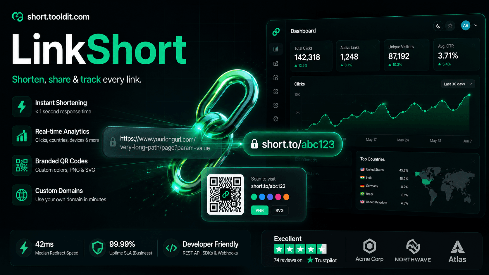
A link-management product for businesses: short branded links on your own domain, click tracking, and monthly subscriptions.
The things clients ask most before starting a ui/ux design project. Anything not covered here, just ask.
Both, and most clients take both — it removes the handover gap where designs get reinterpreted. If you only need design, I'll deliver Figma files and a component spec that a developer can build from cleanly.
Yes. If you have Figma files from a designer, I'll build them accurately and flag anything that will cause problems responsively or technically before I start.
Figma files with the full screen set including edge-case states, a component library with type, colour and spacing tokens, and responsive layouts for mobile, tablet and desktop. If I'm building it too, you get the coded components as well.
Revisions are expected — that's what the design stage is for. I work in rounds at wireframe and UI stage, and we agree the scope up front so it stays clear rather than open-ended.
Yes. That usually starts with a UX review to find where users actually get stuck, so the redesign fixes real problems instead of just updating the visual style.
Yes, and it's designed for mobile rather than adapted to it. Mobile, tablet and desktop each get layout decisions, and everything is checked on real devices.
Show me what you have or describe what you're building. I'll tell you what I'd change, what I'd keep, and what it would take.